
We wanted communication that brought fresh thinking, strong ideas and real creative thought to the category, and that’s exactly what we got. From big campaign ideas to social content and films, the work consistently gave us something new. And importantly, it delivered tangible results, with our social media and YouTube reach growing by over 6,000+. The agency brought creativity that made a real difference.
- Client
- Rentokil
- Services
- Film
- Social Media
MAKING HYGIENE IMPOSSIBLE TO IGNORE.
Rentokil Initial is a global hygiene and wellbeing brand helping businesses create healthier, safer and more hygienic environments. From washrooms and hand hygiene to air care and surface hygiene, Initial takes care of the details people often overlook.
Rentokil Initial helps businesses keep their spaces healthier, safer and more hygienic. From washrooms and hand hygiene to air care and surface hygiene, it takes care of the things people notice only when they go wrong.
We saw an opportunity to make hygiene harder to ignore. So we gave Initial a sharper, more distinctive voice’ turning an everyday, often overlooked category into communication that is relevant, engaging and memorable. Across campaigns, brand communication and creative collateral, we brought Initial’s expertise to life with ideas that make hygiene worth noticing. and the brand hard to miss.
Air Hygiene
Film
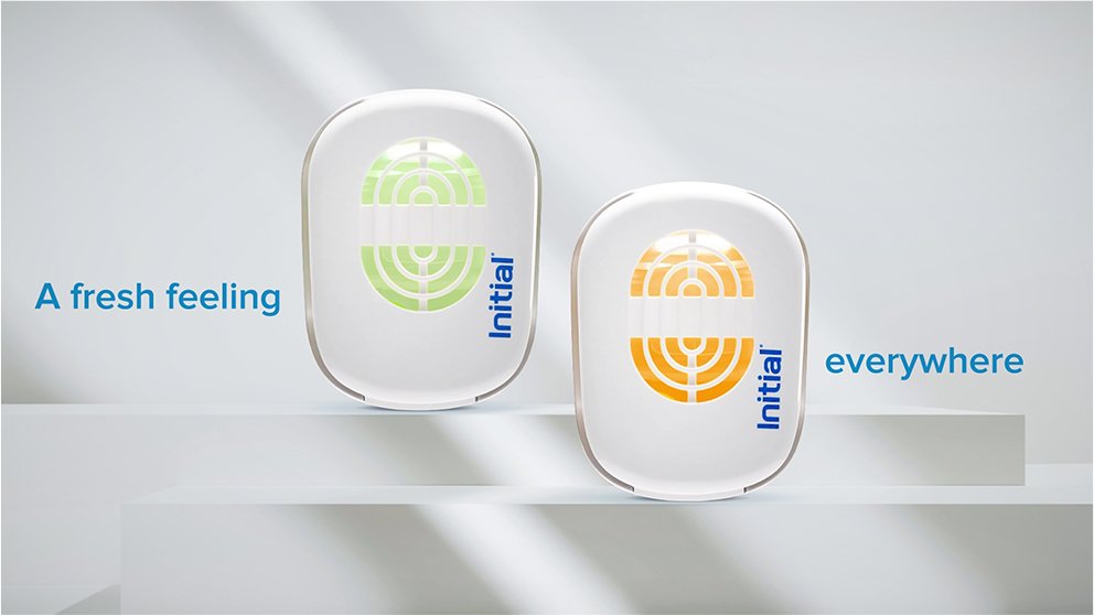
MAKING FRESHNESS FEEL AS GOOD AS IT SOUNDS.
For Initial’s Signature AirFlow Scent, the challenge was to communicate a technical product proposition without making the film feel technical. We turned its smarter, safer and more sustainable fragrance technology into a clean visual story, using an all-white world to make freshness the hero.
From the product’s distinctive design to the feeling of a fresher workplace, every frame was kept light, minimal and easy to absorb, bringing the product benefits to life without overwhelming the viewer with information.
SM Post
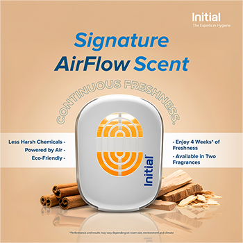
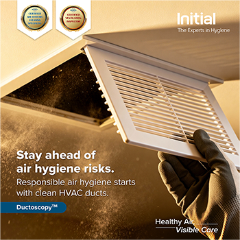
MAKING HYGIENE IMPOSSIBLE TO SCROLL PAST.
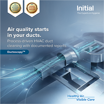
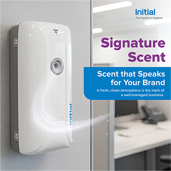
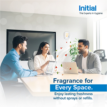
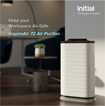
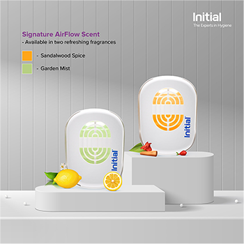
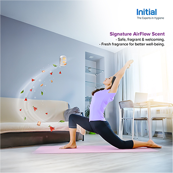
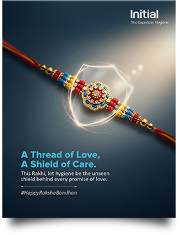
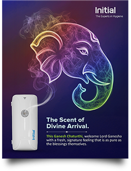
We took Initial’s everyday hygiene expertise and gave it a more unexpected social voice. Instead of defaulting to predictable product communication, we built each post around a sharp thought, striking headline or visual hook, turning everything from air quality and scenting to purification into content with a point of view. Clean compositions, bold typography and idea-led visuals gave the category a fresher, more distinctive personality.
E-mailer
TURNING INBOXES INTO ANOTHER SPACE TO MAKE AN IMPACT.
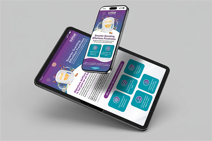
We brought the same idea-first thinking to Initial’s e-mailers, moving beyond straightforward product announcements to create communications with a clear hook, a strong visual story and a reason to engage. Product information was shaped into sharp, digestible narratives, while bold layouts, distinctive graphics and interactive-looking product showcases made even technical solutions feel fresh and easy to explore.
Feminine Hygiene
Menstrual Hygiene Day
WHEN PERIODS FIND THEIR VOICE, SILENCE HAS NOWHERE TO HIDE.
For Menstrual Hygiene Day, we wanted to move the conversation beyond awareness and into dignity. We built the film around a simple but powerful device: a woman seated against a flowing red fabric, the period itself, finally given a voice.
As women across ages and walks of life speak about the fear, shame and silence they grew up with, the red fabric becomes a visual presence that has been ignored for too long. “I am periods. Listen to me.” The film turns a taboo into a voice, and a campaign into a call for change: #PeriodDignity. Period asks for dignity. Let’s deliver it together.
SM Post
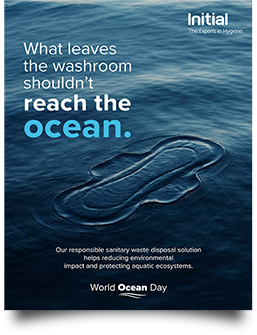
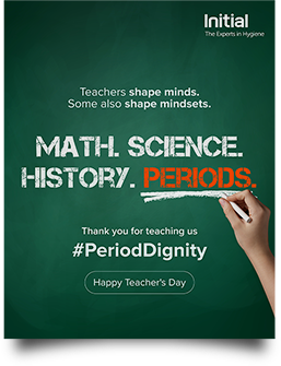
GIVING PERIOD DIGNITY A PLACE ON THE FEED.
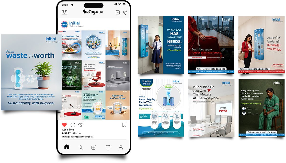
We extended the campaign into a series of social posts that turned period dignity into a conversation, not just a calendar-day message. Each idea tackled a different facet of menstrual hygiene, from the workplace and access to disposal and sustainability, using sharp headlines, human stories and visually arresting compositions. The result was a social campaign that carried the film’s powerful voice into everyday scrolling, while keeping the message clear, periods deserve dignity, everywhere.

Hand Hygiene
SM Post
PUTTING A FRESH SPIN ON CLEAN HANDS.
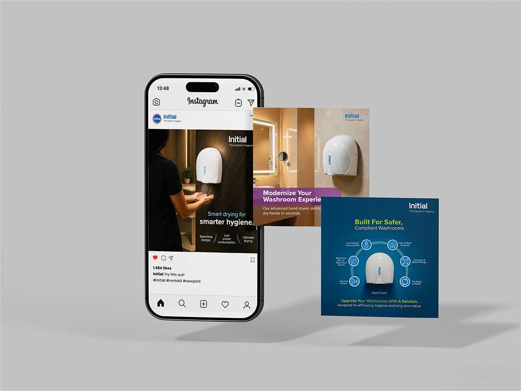
For Initial’s Hand Hygiene portfolio, we looked beyond the usual hygiene clichés to make everyday solutions feel smarter, more relevant and worth noticing. From smart hand dryers to modern washroom experiences, we used sharp headlines, product-led visuals and clean, contemporary design to turn functional features into engaging social stories, giving a traditionally utilitarian category a more distinctive creative voice.
Toilet & Cubical Hygiene
Drainoscopy
TAKING WHAT’S HIDDEN UNDERGROUND AND PUTTING IT IN PLAIN SIGHT.
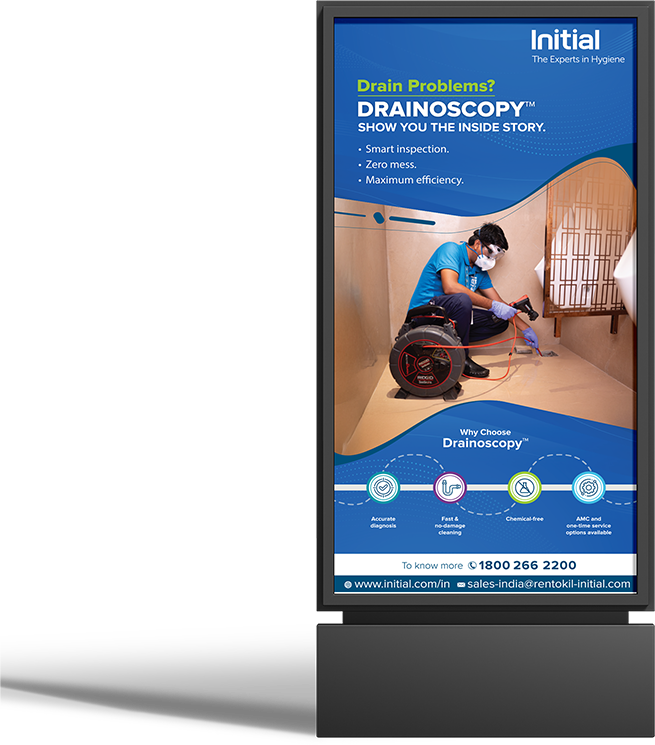
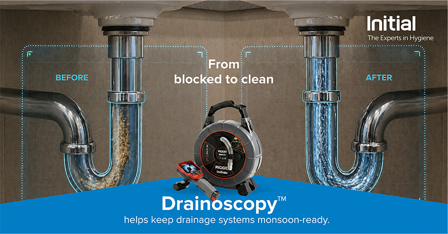
Drain problems are easy to ignore, until they become impossible to. For Drainoscopy, we turned an inherently invisible problem into a visual before-and-after story, using the drainage system itself as the hero. The idea of going inside the problem shaped the creative, while bold typography, cutaway visuals and a clear transformation made the technology instantly understandable. A technical hygiene service became a simple, visual story of from blocked to clean.
Urinal Screens
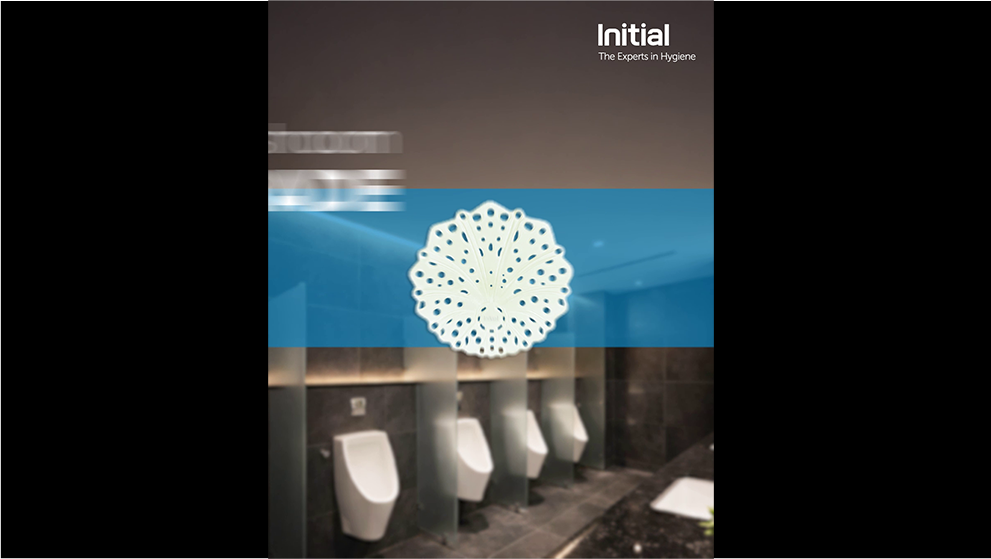
MAKING THE UNSUNG HERO OF THE URINAL IMPOSSIBLE TO IGNORE.
Urinal screens may be small, but they solve some very visible washroom problems, odour, splash, clogs and poor hygiene. We turned those functional benefits into a series of visual-first communications, using the screen itself as the hero and finding different creative hooks around everyday washroom challenges. From monsoon-ready messaging to clean, product-led visuals, we made a utilitarian product feel relevant, contemporary and worth a second look.
Flyer
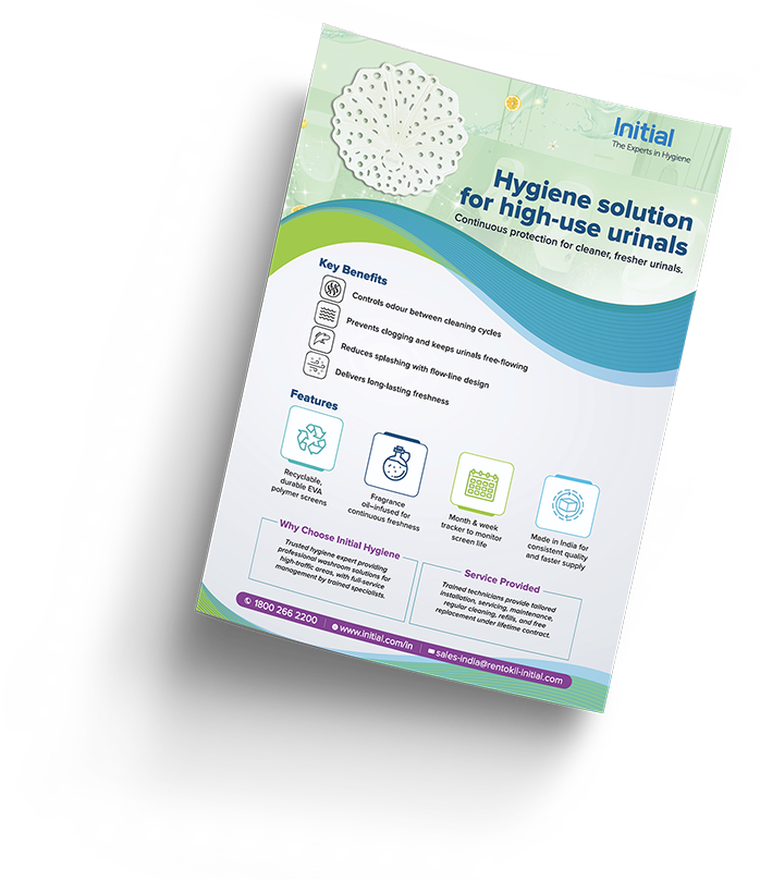
PUTTING THE PRODUCT PROPOSITION ON PAPER.
We turned a functional hygiene solution into a clear, persuasive sales story. The flyer brought together the key benefits, features and service proposition in a structured visual format, using strong hierarchy and product-led design to make the information easy to navigate, without losing the creative personality of the Urinal Screens communication.
Emailer
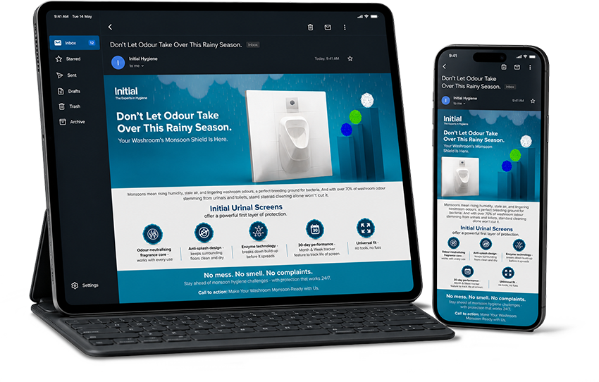
GIVING THE MESSAGE A DIGITAL PUSH.
For the e-mailer, we took the Urinal Screens proposition and designed it for instant impact on screen. A strong seasonal hook, bold messaging and a clean product visual quickly established the problem and solution, while the supporting information built the case. The result was a communication that sold the solution without reading like a sales pitch.
The Hygiene Hub
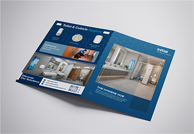
ONE BRAND. ONE HUB. EVERY HYGIENE SOLUTION.
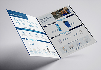
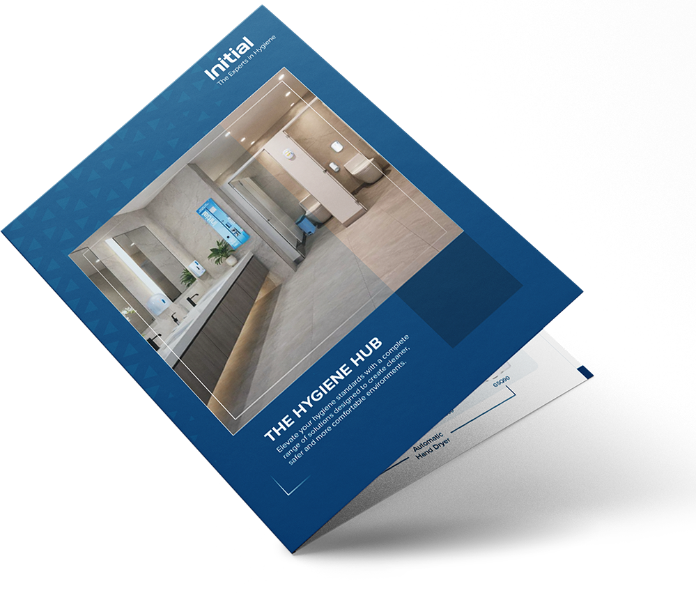
We created The Hygiene Hub as a unified sales tool for Initial, bringing its entire product portfolio under one clear, cohesive idea. Rather than presenting a catalogue of individual solutions, we created a professional visual aid that makes the portfolio feel like one complete hygiene ecosystem. The “Hub” idea brought washroom, hand, air, surface and menstrual hygiene solutions under one umbrella. The brochure was designed as a clear, professional aid, easy to navigate, understand and use in sales conversations.
Hear from the decision makers themselves!


Mohit Goyal