
Working in a highly technical business, we needed an agency that could understand the complexity without making our communication complicated. They found creative ways to make technical stories accessible, while keeping every idea rooted in our business. They understood that the goal wasn't to simplify Anish, but to make Anish easier to understand.

- Client
- Anish
- Services
- Social Media
- Packaging
Anish Pharma operates in a world of complex processes, precise engineering and high-stakes decisions. With decades of expertise and credibility built across the pharmaceutical industry, they had a lot to say.
Our role was to make that expertise easier to understand, more engaging to experience and harder to forget. From building their visual language to creating content, campaigns and digital experiences, we brought the brand to life across every touchpoint.
When the subject is complex, the idea doesn't have to be.
Brand guidlines
Anish Pharma had the expertise, legacy and credibility. What it needed was a clearer, more consistent way to express all of that across its brand communication. The challenge was to create a brand system that could bring everything together while still feeling distinctly Anish.
We didn't want to make Anish look different. We wanted to define what already made it Anish, and create clear principles for how the brand should look, sound and behave wherever it shows up.
We brought the different parts of the brand together and turned them into a clear, usable system. From the visual language and design principles to typography, colour, imagery and communication, we defined the rules that would help Anish stay recognisable and consistent across every touchpoint.
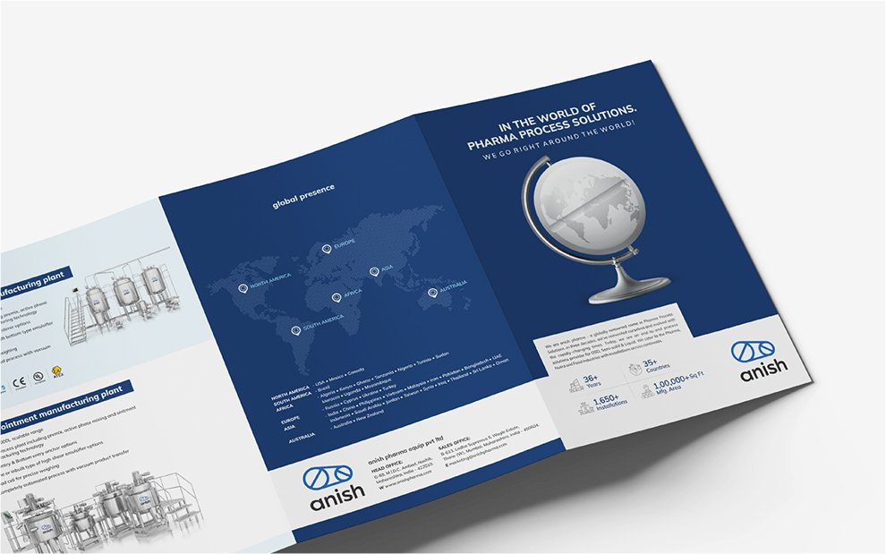
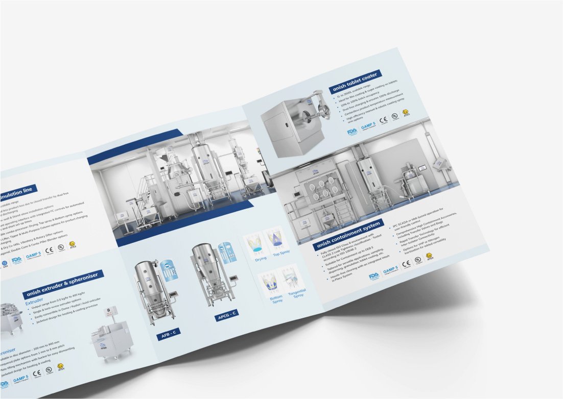
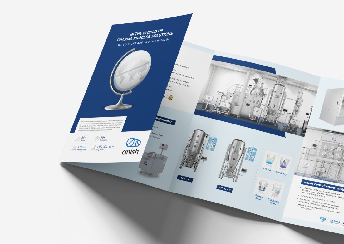
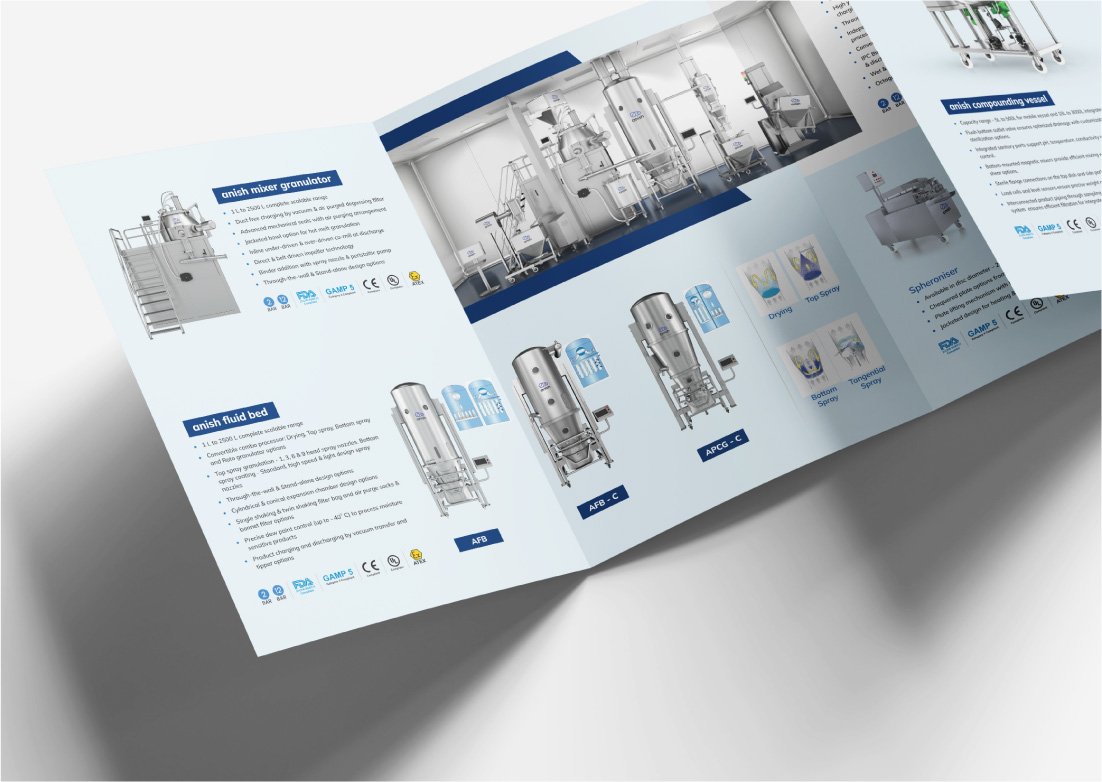
Magazine Ad
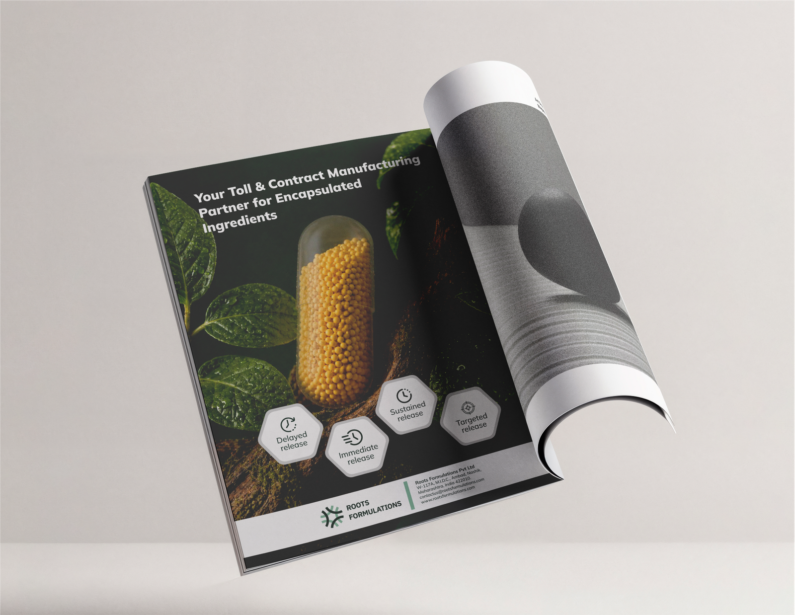
For Anish Pharma’s magazine ad, the aim was to make people feel the thinking behind the technology, rather than make them read another list of features. We wanted to show Anish as a company that looks at pharmaceutical manufacturing differently, where science and innovation work together naturally. So, we found a simple visual idea, nature growing through the molecules inside a tablet, making a complex story instantly more human and memorable.
Diary
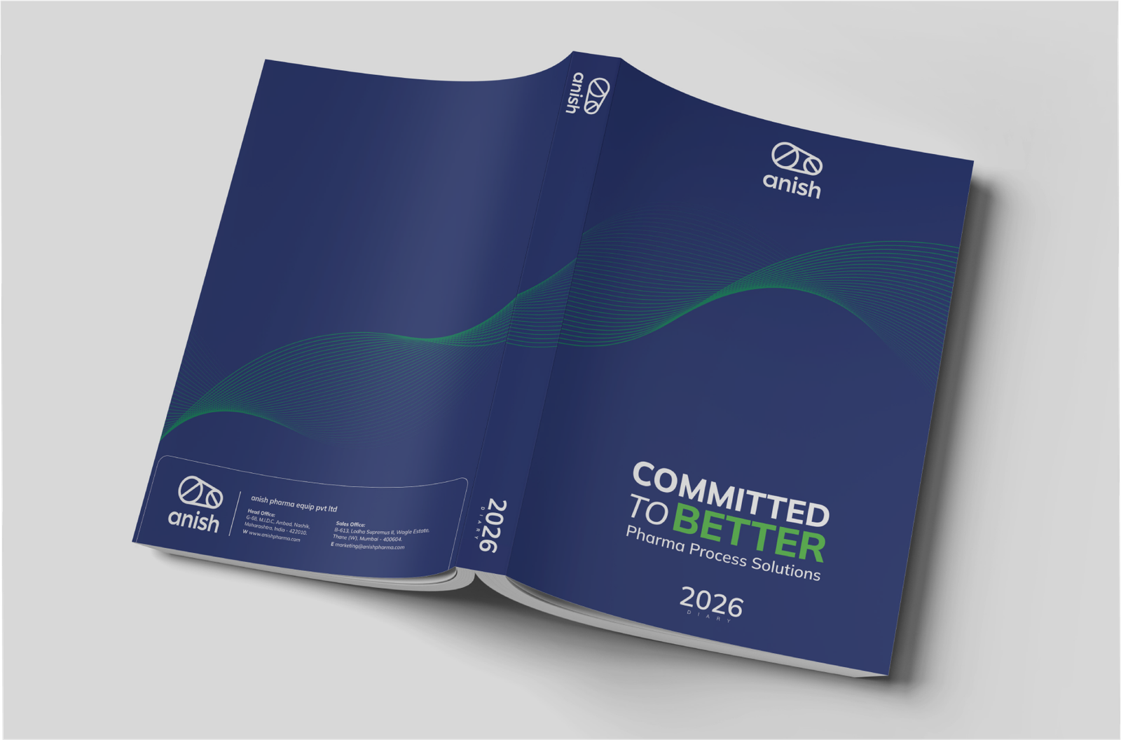
The Anish Pharma diary wasn't just another branded giveaway. It was something that would sit on a customer's or employee's desk, get opened every day and become part of their working routine. So we saw an opportunity to make the everyday object work harder for the brand.
The design was built around use and recall, using Anish's brand colours beyond the expected white, and turning a brand quote into a recurring reminder instead of simply highlighting the year. Every detail was designed to be useful first, while quietly keeping Anish present throughout the year.
SM Post
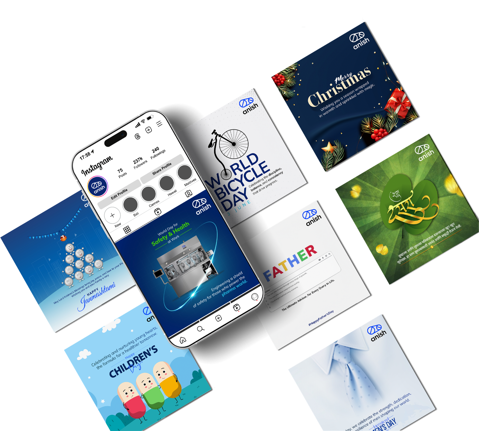
Anish Pharma’s social media needed to do more than simply keep the brand visible. It needed to make a highly technical business feel clear, relevant and engaging in a space built for quick attention. We created a range of content around products, processes, industry moments and occasions, finding the key thought in each and expressing it through sharp visuals and concise communication. The result was a social presence that felt consistently Anish, without making the technical feel complicated.
Hear from the decision makers themselves!


Mohit Goyal